Three Trailers
Guillermo del Toro is making a sequel looking to be an improvement on the first outing, Will Smith making up for Legend in Hancock and this picture of 24 hours lost in New York with a stranger.
Guillermo del Toro is making a sequel looking to be an improvement on the first outing, Will Smith making up for Legend in Hancock and this picture of 24 hours lost in New York with a stranger.
Dabysan writes about saving my life.
Finished The Wind Up Bird Chronicle, and am reminded of what a friend said about Murakami: he writes about unremarkable characters who find themselves in remarkable circumstances. Looking for a recommendation as to what of his to read next. Picked up a copy of The Evolution of Useful Things, and still have The Society of the Spectacle and Michel Houellebecq’s Platform to finish.
Listening to the slap-bass happy Buddy Akai, particularly liking Problems, The Fine Line and Cut Me Up. They allow downloads—a particularly nice touch. They are playing at SXSW!


New video from the San Jose band Xiu Xiu, via The Owl, wrestling moves and other weird shit abound:
I’ve been displeased with certain aspects of the OpenID logo as it stands for a while. The orange is too reddish, the perspective of the o/d curve and arrowhead have always been wrong, and the type is too tightly kerned, light and, well, orange.
Additionally, it’s always worked poorly at small sizes and completely fails to work in monochrome. One school of thought says that the shape is the most important aspect of a logo. The colors, if there are any, should be secondary. The first two iterations used an outlined version of the o/d curve. This time I thought a gap would work better. Turns out it solved both problems at once, as well as strengthened the the I character that anchors the glyph.

Visual comparison of v2 and v3 (PDF).
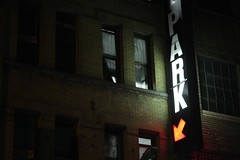
Comfortably ensconced in A + A’s Manhattan abode, between three brick walls, Raptor and Chelsea, nursing the remainder of my cold, listening to In Rainbows, I revised this site. To be specific, I combined two sites: my TypePad blog and my [previously static] personal site, ydnar.com.
The design is a derivation of some recent work, an attempt to push the primary forward, and supporting content into the background without rendering it completely illegible. It’s set in a very desaturated olive, with subheads in 11px capitals, all around a uniform 15px baseline. The type is set in Helvetica Neue, with slightly condensed letter spacing. Links are Pantone 213 on hover. The only images on the page are in posts, and there is nothing except text, links and whitespace otherwise.
Back to this french press and finishing Amelie!
Exit poll links, the New York Times politics blog, the ever-excellent electoral-vote.com, and Taegan Goddard’s Political Wire.
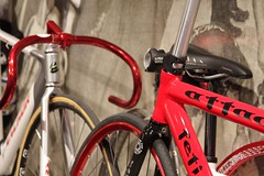
Mad rad Japanese track bike + music + other blog, definitions of success, morale, and how lawyering and doctoring aren’t sexy rockstar like making websites or running hedge funds, and emo electropop from Texas.
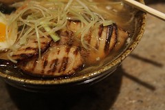
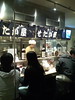 Thanks Anil for the tip: Ramen Setagaya is the best ramen I’ve ever had on this side of the Pacific. Or the country.
I’m not quite sure what won me over—the salt broth, the perfect noodles, the blessedly cooked fatty pork or the mega-kawaii uniformed staff.